Make it
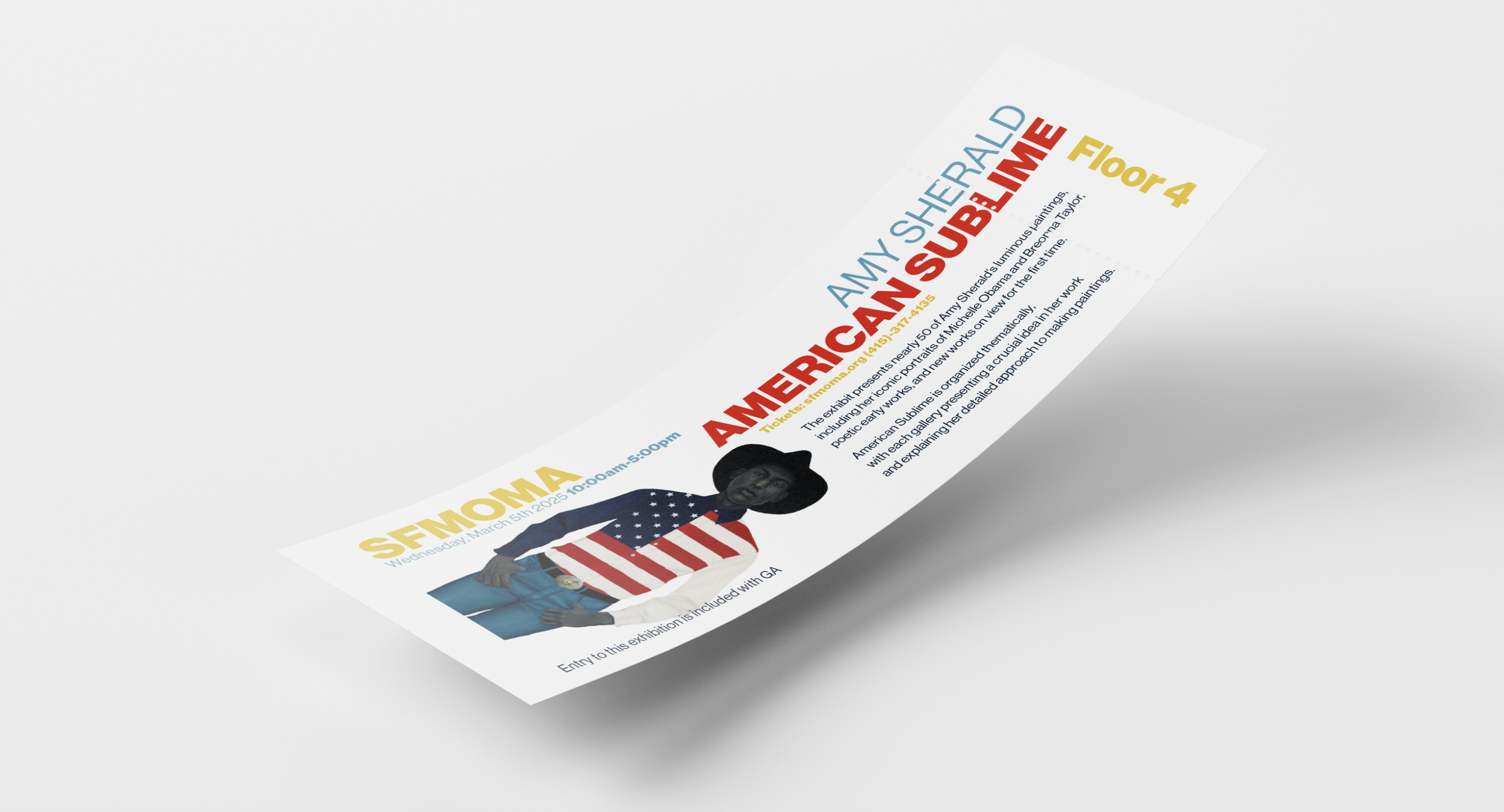
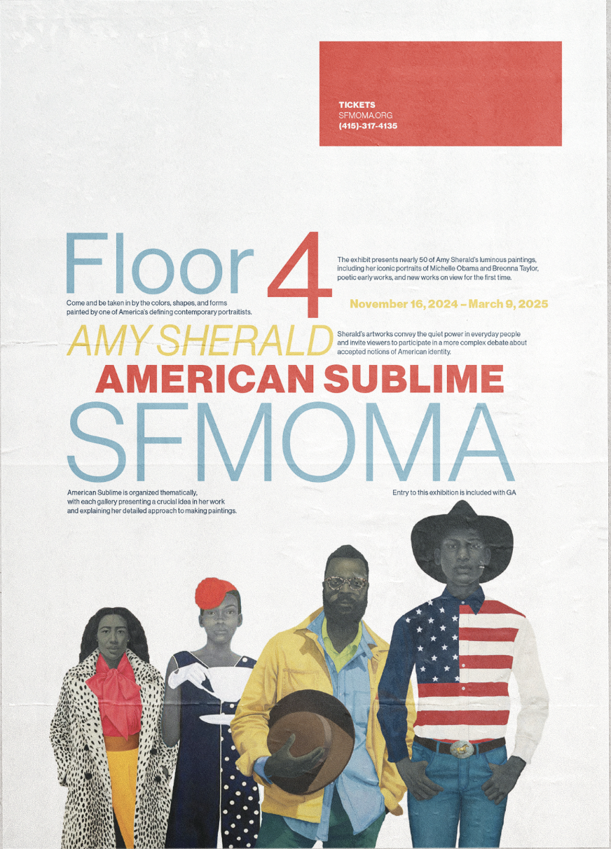
For this project we were assigned to choose between two separate events information and work one of them into an informational poster. In my case I chose to work with Amy Sherald’s: American Sublime exhibit taking place at the SF MOMA. I worked with color and type hierarchy to create a visually engaging and effective poster.
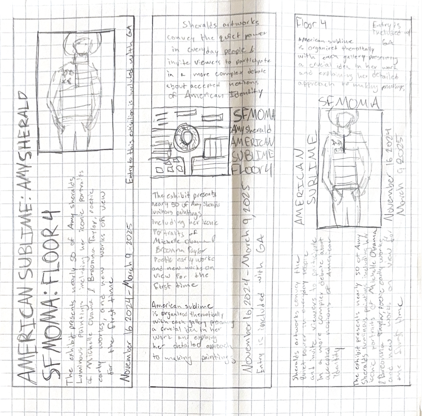
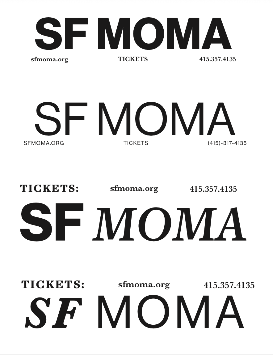
My process began with sketching out ideas for the framework and layout of the poster. I then moved into some type and color studies to resolve the best approach to this information. After deciding on my palette and layout I began to work digitally and put everything into place. Using a collage of Sheralds’ artwork and the use of a powerful typeface, I completed this above poster for American Sublime.
Completing this process helped immense amounts when putting together the final piece. By initially laying out all of my content I was able to easily formulate the digital poster and identify the most important aspects.
Process